
Glossary
- Impressions: The number of times an ad is shown. Rich media is billed on a CPM basis (every 1000 impressions).
- Clicks: The number of times a user touches a banner to expand it.
- CTR (click-through rate): The number of times ads are clicked divided by the number of impressions. For example, an ad shown 1000 times that receives 11 clicks has a CTR of 1.1%.
- Cost: The total amount paid for the reported time period.
Optimization
A mobile ad is really mobile website. If the ad has multiple views, switch through them by showing/hiding different <div> blocks. It is important to be sure that the ad is contained to one single HTML page. Load hidden parts of the ad in the background and record metrics globally. Apply the same optimization techniques that are associated with web development. Most importantly make as few HTTP requests as possible and keep total ad sizes under a couple hundred kilobytes.
CSS
Define all stylesheets in the <head>. Never in the body which would apply styles after the content is created causing reflow. Also be sure to combine and compress all CSS files using a compression tool. This will reduce request size and, more importantly, the number of requests made.
- CSSCompressor ( http://www.csscompressor.com/ )
- LESS ( http://lesscss.org/ )
- yuicompressor ( http://developer.yahoo.com/yui/compressor/ )
Javascript
When possible source scripts at the bottom of the <body> and compress all JS files using compression tools. By defining the javascript at the bottom, it allows the user to see the structure of the site without having to wait for the scripts to load.
- yuicompressor ( http://developer.yahoo.com/yui/compressor/ )
- Closure Compiler ( https://developers.google.com/closure/compiler/ )
- jsminify ( http://jscompress.com/ )
Images
Images play a large role in rich media ads. This section helps find the sweet spot between sharp resolution and loading latency.
JPEG
When possible use JPEG over PNG due to file size and compression options. Experiment with a compression level between 20 and 40 percent.
- Lossy Image Compression ( http://calendar.perfplanet.com/2011/lossy-image-compression/ )
PNG
PNG-8 is best for images with text because it remains sharp. PNG-24 is required for transparency. Applying a slight posterization effect to a PNG can further reduce its file size; however, do not use this technique if the image contains colors that need to match an exact color on accompanying assets.
- PNGCrush ( http://pmt.sourceforge.net/pngcrush/index.html )
Spriting
Use CSS image sprites wherever possible to reduce HTTP requests.
- Sprite Cow ( http://www.spritecow.com/ )
CSS images
Define small images (icons, spinners) inline using Base64 encoding to reduce HTTP requests. Loading bars can be built entirely in CSS3 to reduce loading times too.
- Base64 Encoder ( http://www.base64encode.org/ )
- CSS3 Progress Bars ( http://css-tricks.com/css3-progress-bars/ )
Audio & Video
In addition to our recommended encodings below we suggest looking at the official media encoding guides:
Audio
| Format | AAC LC, .m4a extension |
|---|---|
| Bit rate | 128 kbps Stereo channel |
| Sample rate | 44.1 kHz |
Video
We recommend having two separate encodings: one for mobile networks and one for WiFi. If you cannot accommodate for both, only include the mobile format.
| Network | Format | Bit rate | Audio | Resolution |
|---|---|---|---|---|
| Mobile | H.264 encoding with MP4 format | 140kbps bitrate * | 64 kbps bit rate, 22.05 kHz sample rate, mono audio channel | 320 x 480 on phones, 384 x 512 on tablets. |
| WiFi | 1000kbps bitrate | 128kbps bit rate, 44.1kHz sample rate, stereo audio channel |
Video immediately following a splash page is recommended to be less than 15 seconds so it starts playing reasonably quickly. In general videos longer than 60 seconds have load times users are not willing to wait for.
PreLoading
Preloading assets provides a smooth, full, and complete user experience. Using this code while the user sees a loading screen prevents displaying partially loaded assets.
    // Preload all assets at once
    for (var i in assets) {
      var img = document.createElement('img');
      img.src = assets.src;
      img.style.opacity = 0;
      img.addEventListener('load', renderMedia.bind(this));
      document.getElementById('container').appendChild(img);
    }
In this case, renderMedia can then increment a counter (since an asset has been loaded) and then proceed rendering when the counter reaches the amount of assets.
    var renderMedia = function () {
      loaded_assets++;
      if (loaded_assets == assets.length) {
        // Begin rendering the actual ad
      }
    }
We also recommend prioritizing specific assets based on their importance. For example, load the branding assets (background and logos) before loading the content (images in the carousel, video, etc). This is especially important in the beginning as users will be able to see the brand before the loading is complete. Drop off rates between asset categories can be determined using event tracking in analytics.
Content Safe Areas
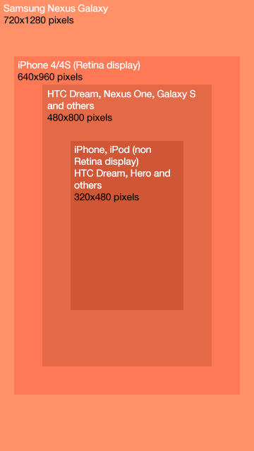
The mobile ecosystem is full of different devices of various resolutions and pixel densities. If you are targeting a specific device, say the iPad 1 & 2, you know that for a full screen ad you have a canvas of size 768 x 1024 (1024 x 768 in landscape orientation). But what if you want to support a wide array of sizes? Granted, you can create separate ads for different devices but you can do one better. You can constrain your ad’s content to a content safe area and supply a background the size of your largest anticipated device to flow out on larger devices.
Here is an example for implementing content safe area on mobile devices:
      #container {
        overflow:hidden;
        width:100%;
        height:100%;
      }

      #safeArea {
        position:absolute;
        z-index:2;
        top:50%;
        left:50%;
      }

      .portrait {
        width:320px;
        height:480px;
        margin-top: -240px;
        margin-left: -160px;
      }

      .landscape {
        width:480px;
        height:320px;
        margin-top: -160px;
        margin-left: -240px;
      }
      <div id=”container”>
        <div id=”safeArea” class=”portrait”></div>
      </div>


In this case, we assume that we won’t be targeting mobile devices with a resolution smaller than 320 x 480. You would then listen for the ‘deviceorientation’ event to apply the appropriate class to the content safe area (‘portrait’ or ‘landscape’). Now you must define a larger background image that is centered similarly to the content safe area:
    .backgroundPortrait {
      position: absolute,
      top: 50%,
      left: 50%,
      width: 720px,
      height: 1200px,
      margin-left: -360px,
      margin-top: -600px,
      display: none
    }
In this case, we choose an image of size 720 x 1200 since most phone resolutions are under that size. Once the image has finished loading, change the display style attribute to show the element.
Animations
This section provides an overview on what animations are possible on specific mobile operating systems and what happens when they’re combined. The animations listed here are based on CSS3 animations available for WebKit browsers.
Standard Transitions
To animate a standard transition simply define the transition and animation to the object. Then change the original transition by:
- Overriding it in a second css class and applying it
- Overriding the style directly with javascript
- Removing the style and having it fallback to another transition
Example: The following CSS classes allow a DOM element with the class ‘button’ to expand 200% by adding the class ‘animate’. The demo below toggles the 'animate' class on click/touch.
      #animation-test {
        -webkit-transition: -webkit-transform 1s linear;
        -webkit-transform: scale(1);
      }

      #animation-test.animate {
        -webkit-transform: scale(2);
      }
Demo:
Keyframe Animations
Keyframe animations allow specifying different properties at specific points of a larger animation. Simply define a keyframe animation and specify the animation properties to a particular CSS property. Example: The following definition causes an element to move to 60px to the right, pause, and then move another 60px to the right. It then runs that animation in reverse to its original position. The entire animation is done twice. Tap/Click the demo below to toggle the following animation class.
    @-webkit-keyframes moveAnimation {
        0% {  -webkit-transform: translateX(0px);  }
        50%    {  -webkit-transform: translateX(60px); }
        100% {  -webkit-transform: translateX(120px); }
    }

    #animation-test2.animate {
        -webkit-animation-name: moveAnimation;
        -webkit-animation-duration: 1s;
        -webkit-animation-iteration-count: 4;
        -webkit-animation-direction: alternate;
        -webkit-animation-timing-function: ease-in-out;
    }
Demo:
Device Compatibility
| iOS | Android Phones (2.0+) | Android Tablets (3.0) | |
|---|---|---|---|
| CSS3 Transforms: rotate, translate, scale, skew, matrix | Yes | Yes* | Yes |
| CSS3 Transforms 3D: scale3d, translate3d, Perspective, Backface | Yes | 4.0+ | Yes |
| CSS3 Transitions: Animations between two states | Yes | Yes* | Yes |
| CSS3 Animations: Keyframe Animations | Yes | Yes* | Yes |
Sample Animations
These are the transform properties that change the aspects of an element which can be animated. The animations are labeled by what animation they perform. By tapping/clicking the orange boxes below, the animate class will be toggled on the object via Javascript.
Move
Description: Causes an element to move in any direction
CSS solution: -webkit-transform: translate3d(x, y, z)
Details: Use this function over the standard translate(x,y) function as it
allows for the hardware acceleration to kick in.
    /*
     * The following CSS will move an element 100px to the right
     */
    #animation-test3 {
      -webkit-transition: -webkit-transform 1s linear;
      -webkit-transform: translate3d(0, 0, 0)
    }

    #animation-test3.animate {
      -webkit-transform: translate3d(100px, 0, 0)
    }
Demo:
Grow/Shrink
Description: Cause an element to scale up or down in size
CSS solution: -webkit-transform: scale3d(x, y, z)
Details: This function is preferred over the standard scale(x) since it allows for hardware acceleration. The only drawback is that it does not rerender the object at the end of the animation (this causes the final frame to look blurry if you are doing a ‘grow’).
You can solve this in three ways:
- Use the scale(x) transform
- Add an event listener for ‘transitionend’ and then replace the 3d transform with a standard transform.
- Since Webkit animates as if it were an image, it's better to start big and scale down. Write CSS in the "end state" and scale it down for normal state. Eg. To grow from scale3d(1, 1, 1) to scale3d(2,2,1), double the size of the image and scale from scale3d(.5, .5, 1) to scale3d(1,1,1).
      /*
       * The following CSS will cause an element to grow to twice its size
       */
      #animation-test4 {
        -webkit-transition: -webkit-transform 1s linear;
        -webkit-transform: scale3d(.5, .5, 1);
      }

      #animation-test4.animate {
        -webkit-transform: scale3d(1, 1, 1);
      }
Demo:

Fade In/Out
Description: Cause an element to dissolve in and out of picture
CSS solution: opacity: 1 or opacity: 0
Details: Perform a webkit transition over the opacity.
    /*
     * The following CSS will cause an element to fade out
     */

    #animation-test5 {
      -webkit-transition: opacity 1s linear;
      opacity: 1;
    }

    #animation-test5.animate {
      opacity: 0;
    }
Demo:
Resources
Ads APIs
- AdMob API for Ads - Use in mobile apps to expand banners and start interstitial animations at the correct time
- MRAID - Industry-standard API currently in development to replace the AdMob API for Ads
- MRAID Specification - API Spec for developing MRAID ads.
- DoubleClick HTML5 build guide - Use for DoubleClick Rich Media ads
HTML5 & CSS3
- HTML5 Rocks - Best place to learn HTML5
- When can I use... and Mobile HTML5 - Lists which HTML5 functions work on which devices
- DeviceOrientation Event Specification - Accelerometer and gyroscope API
- W3C Mobile Web Application Best Practices